


The Full Story
ABOUT OUR LOGO
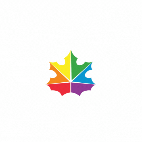
Our logo is very simple. We chose the Canadian Maple Leaf in respect and honour of the Canadian Flag.

The Rainbow coloured (Acer Macrophyllum)
The 6 colours represents the changing seasons.
OUR FLAG
When we designed this flag,
we did so with the intention to respect the original Canadian flag.
We also wanted to respect the original pride flag by infusing the ORIGINAL TRUE REAL RAINBOW COLOURS.
As a symbol of our patriotism, we included the (Big Leaf maple) or (Acer Macrophyllum) to compliment the design.
It is no coincidence that the true Six colours which forms a rainbow in nature, just also happens to be the vein separation on this powerful and beautiful leaf.
We ended up choosing this simplistic animated look, which will be easy to incorporate and infuse in all future designs and official uses.

